Goodgrowth: Boot Sequences, Spinning Discs, and the Art of the Portfolio
Discover the process behind Goodgrowth, from its console-inspired concept to the 3D, motion, sound, and technical details that bring the experience to life.
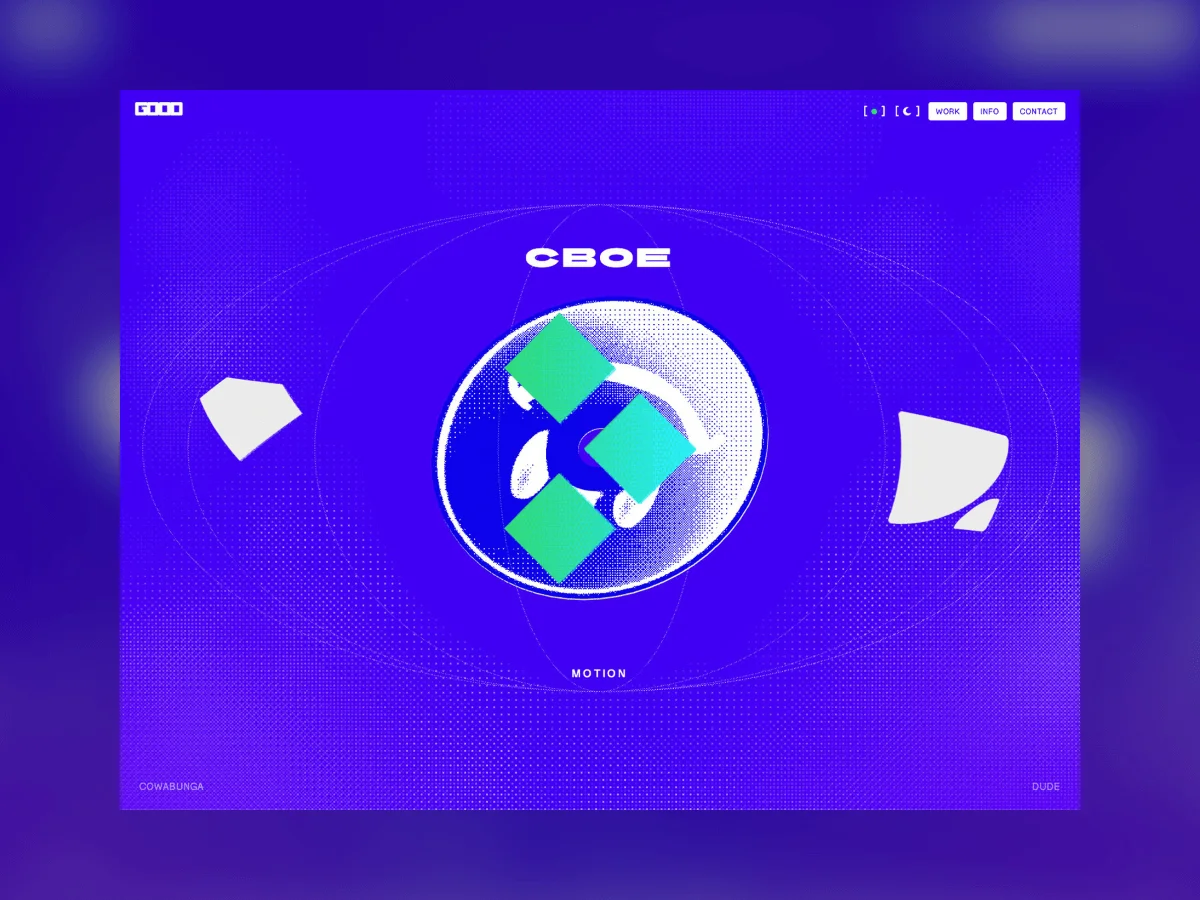
Creating a personal portfolio is always the most fun but can also be the most daunting. When the direction and creativity are ultimately your call, it can sometimes make it even harder to decide which way to go. When designing my site, I wanted to begin crafting it with a relatively clear look and feel in mind and also institute a self-imposed timeline so that it would actually get finished and not relegated to the bin or backlog.
The late 90’s/Early 2000’s era of video gaming has always been one of my favorites. I vividly remember the startup and boot screens for PlayStation and Dreamcast and I wanted to carry that forward to convey my visual aesthetic. Call it nostalgia, call it being old or just thinking back to simpler times. Ultimately, I really wanted to create a feeling of powering on a console and revealing the experience.
It starts with a sketch
One of the fundamentals I went in with developing my site was to extend out of my comfort zone. With a background in HTML/CSS/JS, there’s so much outside of my standard skill set and that’s when integrating Claude Code into my workflow really helped me output what I had in my mind.
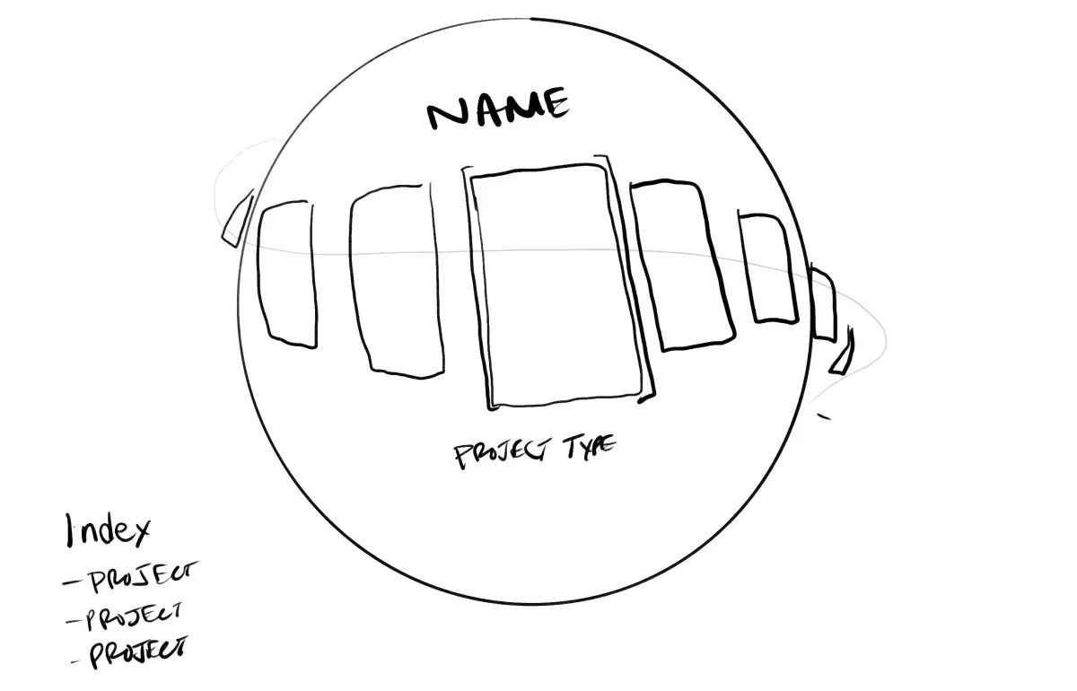
The idea was to create a seamless scroll loop that sat on top of a globe that would contain projects the user could either swipe or scroll through. In addition to that, I wanted the globe to also interact and respond to scrolling. The final piece to the equation was adding a disc model that could rotate around in the middle, again, conveying the feeling of the startup screens of the past.
Tech stack
- Three.js: Used for the main 3D elements of the site
- GSAP – Handled almost all of the animation
- Lenis – Smooth scroll: enabled
- Vite – For the entire build
- Web Audio API – Ensuring the sound rang true
- No framework – vanilla JS & ES modules
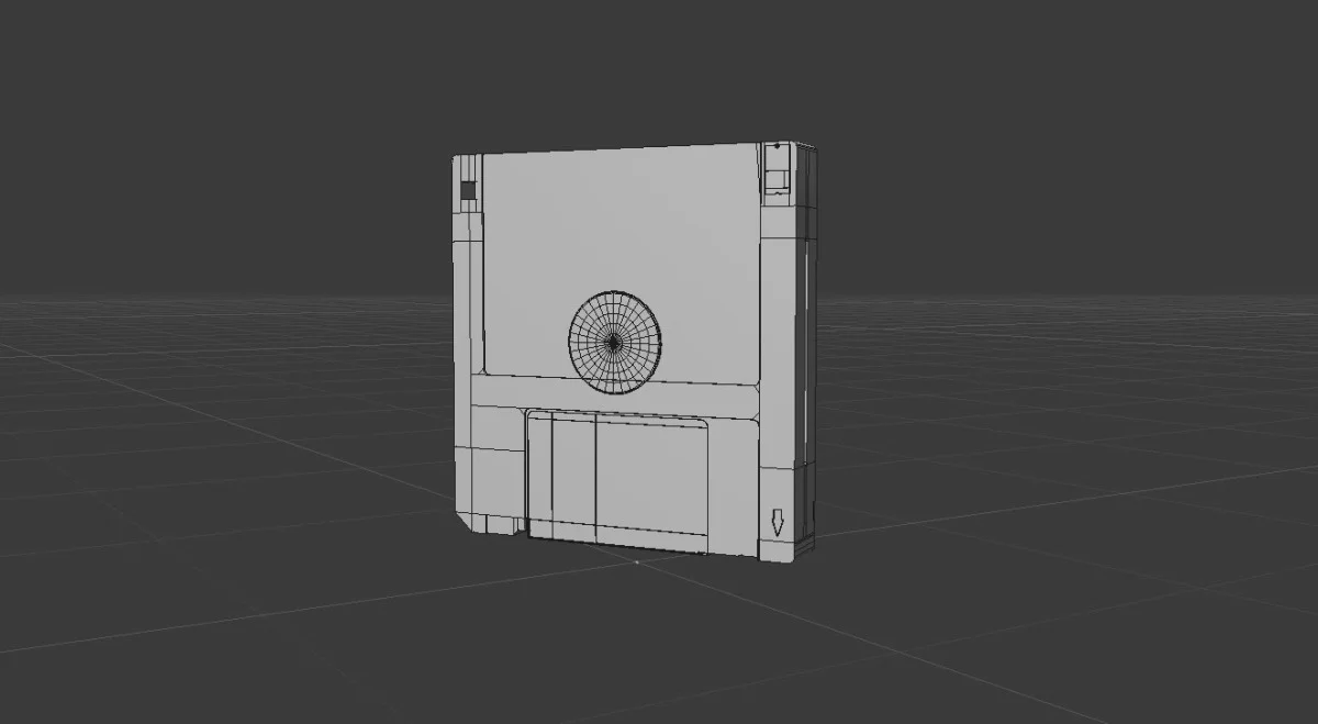
- Cinema4D – CD and Floppy Disk assets modeled then converted to GLB for WebGL
Boot it up
Having a site that felt cohesive from preload to reveal to project transitions was another fundamental that I trued back to. Starting with the “Insert Disc” screen, this served to ensure audio was pushed at the forefront and not just an afterthought. The rotating disc was handled via simple rotateY within CSS so that I didn’t accrue any unnecessary code and to keep it as simple as possible. Upon entering, the preloader begins, I wanted to keep the load numbers tied to the logo as much as possible so I swapped O’s for 0’s.
The part I spent the most time on was the thumbnails that fan out and then spiral back in before the reveal. I kept trying to author that as a spiral path and it always looked mechanical. What finally worked was realizing a spiral isn’t a path at all — it’s just angle increasing while radius decreases. Each thumbnail stores its angle and radius separately, a ticker converts them to x/y every frame, and the “spiral” is what falls out when you accelerate the shared angle and collapse the radii at the same time.
// angle and radius are tweened independently — no path involved
const placePreviews = () => {
  for (let i = 0; i < prevEls.length; i++) {
    const a = ((PREV_ANGLES[i] + orbit.t) * Math.PI) / 180;
    gsap.set(prevEls[i], {
      x: Math.cos(a) * prevState[i].r,
      y: Math.sin(a) * prevState[i].r,
    });
  }
};

// the gather: angle SPEEDS UP while every radius collapses to zero
out.to(orbit, { t: '+=140', duration: 1.3, ease: 'power1.in' }, 0);
prevEls.forEach((el, i) => {
  out.to(prevState[i], { r: 0, duration: 0.55, ease: 'power2.in' }, 0.09 * i);
});
The 0.09 stagger is what gives it a tail — the trailing thumbnails are still orbiting while the leaders have already vanished into the centre.
Staying global
A challenge I kept running into when creating the globe was that the angle was not feeling right. In certain states, you would see the poles of the globe and it made for a non-ideal visual. Settling on an orthographic view became a structural decision for the look, the reference I was working from was a flat drawing of nested ellipses and perspective bulges the near half of every meridian so the curves cross and kink near the poles. Ortho keeps them exact.
The next challenge was the project strip that hugs the carousel. I didn’t want it to just be a straight-horizontal strip and instead wanted it coming in from the top-left to bottom-right. This took quite a few iterations and ultimately settled on the project band as a single texture atlas, with the curve applied as a latitude shift rather than a rotation so the band stays exactly on the sphere.
One of the coolest details is invisible. The magnetic detent settles the ring on tile multiples but the meridians rotate at their own ratio so every rest pose was landing on a slightly different meridian phase, the globe never looked the same twice. Snapping the counter-rotation ratio so one tile step advances the meridians by exactly one meridian step fixed that. The constant went from 0.6 to 0.571 which is hard to see when in motion, but now every rest pose reproduces the reference layout.
const TILE_STEP     = (Math.PI * 2) / projects.length;
const MERIDIAN_STEP =  Math.PI / MERIDIAN_COUNT;

// snapped so one detent = exactly one meridian step
const GLOBE_SPIN =
  (Math.max(1, Math.round(0.6 * TILE_STEP / MERIDIAN_STEP)) * MERIDIAN_STEP) / TILE_STEP;
For mobile, an earlier build was taking too long to swipe from project to project, the bug turned out to be that two things were fighting: the live drag was rotating the globe as your finger moved and then the release logic tried to snap to the nearest project from wherever it had ended up. Rounding a half-rotated value would sometimes land back where you started so a light swipe did nothing at all. The fix was to ignore the drag completely on release and commit exactly one step from where the gesture began.
const dir = netDX > 0 ? -1 : 1;
// snap from where the gesture STARTED, not from the half-rotated current value
targetRot = (Math.round(touchStartRot / step) + dir) * step;
Feeling alive
To incorporate some elements of interactivity, I set my focus to mouse interactions. Like the globe spinning on scroll, the center CD element also rotates based on scroll while also maintaining its own rotation when there’s no interaction happening.
For the project pages, when you hover over the project icon image, you’re met with some distortion which was a combination of ping-pong flow map and velocity field to create the chromatic aberration smear which gives the feel of liquid. The reason it trails and settles insetad of tracking your cursor exactly is that the field decays rather than resets, each frame reads the previoius one, multiplies it down and adds a splat weighted by pointer velocity.
vec3 prev = texture2D(uPrev, vUv).rgb * 0.94;   // the decay IS the trail
prev += vec3(uVel * s, s * length(uVel));       // velocity, not position

// red and blue sample at opposite offsets — that's the chromatic split
float cr = texture2D(uMap, uv + flow * 0.05).r;
float cb = texture2D(uMap, uv - flow * 0.05).b;
Dither, Dither, Dither
The lo-fi polygonal aesthetic of the Y2K gaming era is so iconic and to riff off of that, I went with a heavy dithered approach to my shaders throughout the site. From the globe to the cloud background, integrating the Bayer dither helped me display this and keep true to the original vision. It’s a two-line function reused everywhere and it works in screen space rather than UV space so the pattern stays locked to the display like a print artifact instead of swimming around with the geometry.
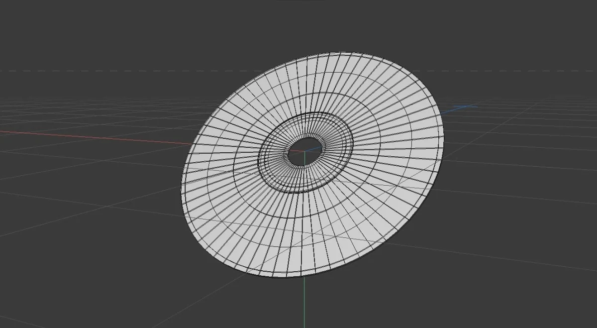
For the CD that spins in the center, I used a combination of MeshPhysicalMaterial, iridescence and PMREM environment. This took a few iterations, especially to get the bow-tie pattern gradient correct on the CD and not just a radial reflection. That was the thing I kept getting wrong, I started with concentric rings, then a pinwheel and neither really read as a CD. Viewing a CD in real life, you see the bow-tie pattern more clearly and that the reflection pivots with your viewing angle rather than spinning with the geometry.
float sweep = dot(normalize(vDiscNormalV), normalize(-vViewPosition));

// the sweep term is what makes the cross PIVOT rather than rotate with the disc
float axis   = ang - sweep * 1.6;
float bowtie = pow(abs(cos(axis)), 6.0);   // two-lobe cross through the centre

// spectral fringe splits green↔magenta along the band's dark edges
float edge   = sin(axis * 2.0);
vec3  fringe = hsv2rgb(vec3(fract(0.30 + edge * 0.22), 0.85, 1.0));
Another feather in the cap for Three.js is the ability to apply textures to the GLB’s cleanly which meant I didn’t have to rely on any texturing within Cinema4D. Since every mesh gets its own material assigned on load, all the PBR maps the exporter wrote were dead weight. Stripping them plus weld+quantize took the main CD GLB from 9.7MB down to 182KB with no visual difference at all.
From one to another
Harkening back to an earlier sentiment around creating a seamless experience, I wanted the transitions to feel effortless and keep you engaged to explore the site further. There were a few different transitions on the site. The main one is from the landing page to a project which included a five-bar wipe that reveals the title of the project about to be viewed and then wiping out to reveal the project itself. This was another iterative portion of the site and what helped the most was creating storyboard elements to show what I wanted the intended outcome to be.
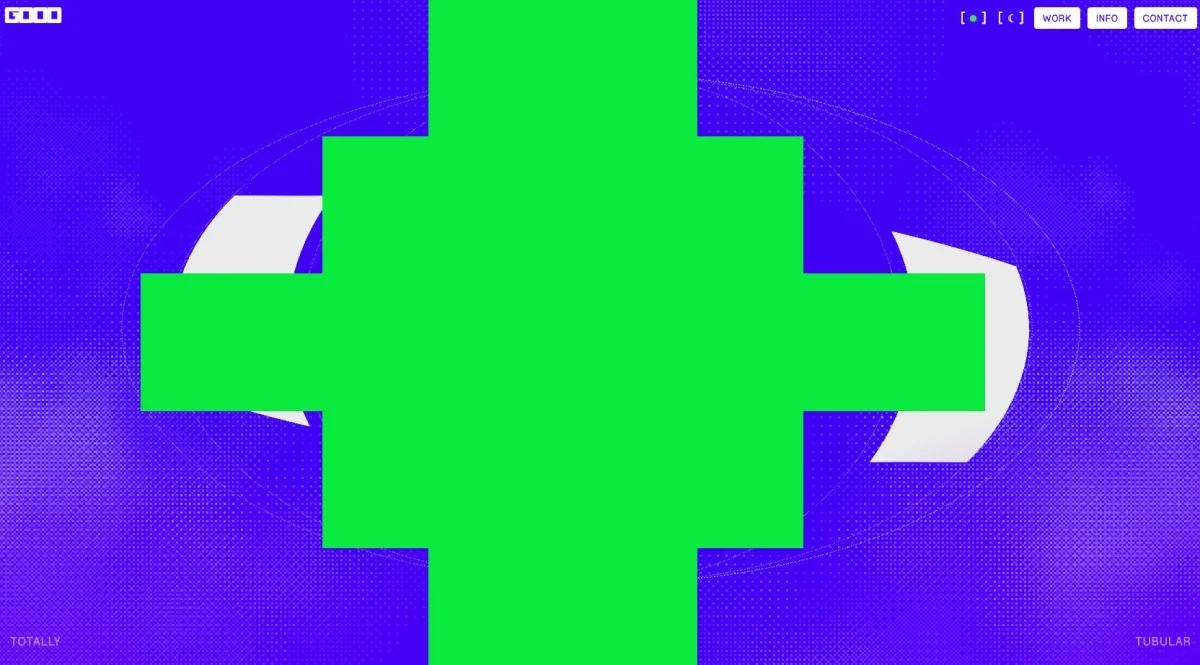
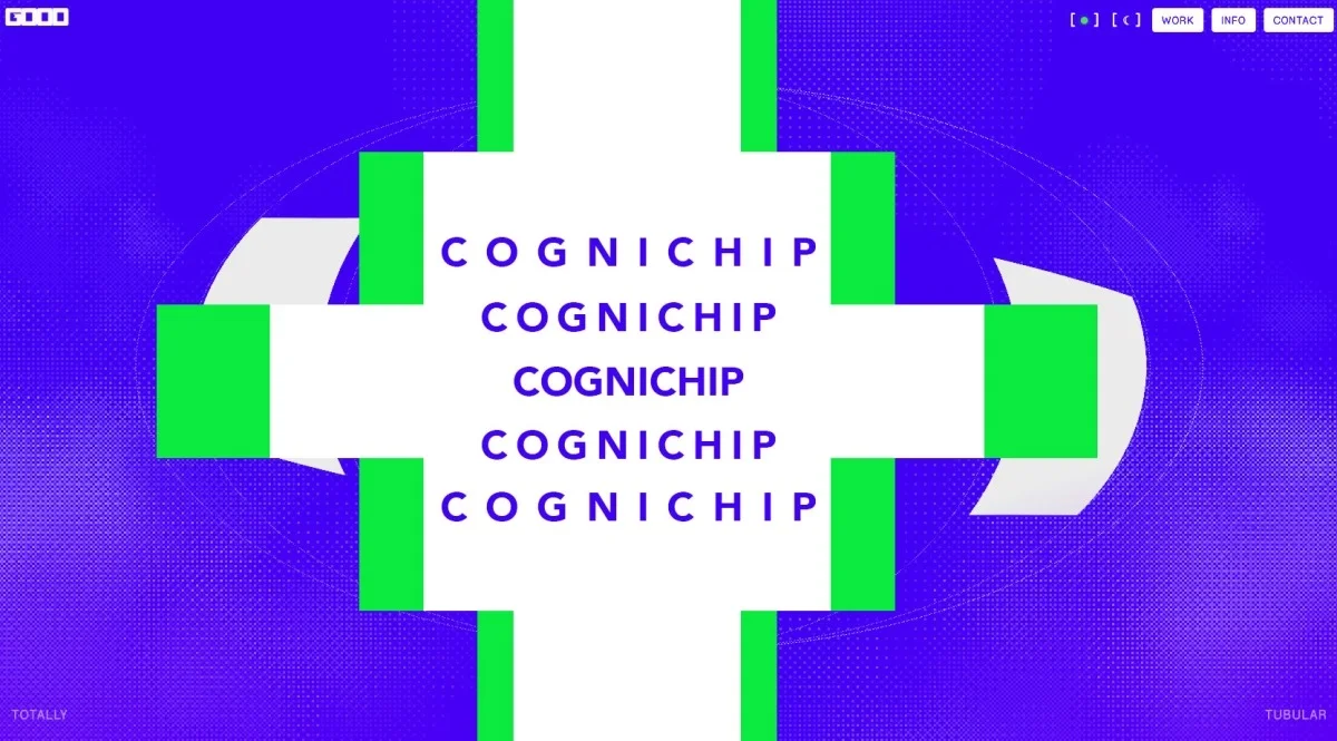
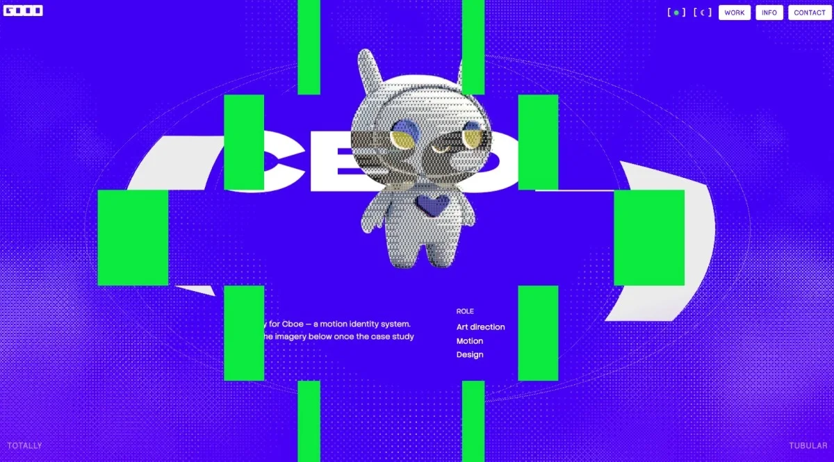
The reveal isn’t a fade. Each of the five bands is split into two overflow-hidden halves pinned to the the left and right edges and every half contains a full-viewport copy of the settled title, offset up by its own band’s position so all ten lne up as one continuous piece of type. Collapsin their width opens a window in the middle, the bars themselves are the track matte.
// each half clips a different horizontal slice, but the -top offset means
// every title replica sits at the same absolute screen position
inner.style.top = `${-top}dvh`;

// collapsing the halves to zero width IS the reveal — centre bands lead
pwHalves.forEach((pair, i) => {
  tl.to(pair, { width: 0, duration: 0.6, ease: 'power3.inOut' },
    1.8 + Math.abs(i - (pwHalves.length - 1) / 2) * 0.07);
});
The page-to-page transitions are probably one of my favorite parts of this site and as mentioned, needed to feel effortless. The idea was to have a progress fill appear on the project icons as you scroll with a percentage so you could easily know when you were going to see the payoff. One of the trickier elements was ensuring the project icon smoothly shifted and settled at the correct spot at the top of the site, allowing the other elements to build in around it.
This was a bit more challenging than originally expected and also introduced some issues around scroll behavior and if the user scrolled too much immediately after the fill, it would send them halfway down the page. The solution was to lock the icon to the top and not allow any interaction until the build finished.
const IDLE_MS  = 220;    // wheel considered "stopped" after this quiet gap
const MAX_WAIT = 4000;   // safety cap so it can never hang

const settle = () => {
  const now = performance.now();
  if (now - _swallowLastInput < IDLE_MS && now - t0 < MAX_WAIT) {
    requestAnimationFrame(settle);   // still coasting — keep waiting
    return;
  }
  stopInputSwallow();
  _pinTop = false;
  el.detail.scrollTop = 0;
  transitionLock = false;
};
Sounds wonderful
Beyond just the visual, one of the most memorable components of a startup screen was always the audio. Immediately, you knew which system you were on and that the excitement was building. This was a highly important aspect that I wanted to get right so I contacted my friend Lane Fujita to craft this as he and I both share a love of gaming and have spent countless hours throwing down on the controllers. Not only was I completely blown away with what he sent, Lane sent over a detailed spec document that spelled out timing for the audio as well as when and when not things should be heard.
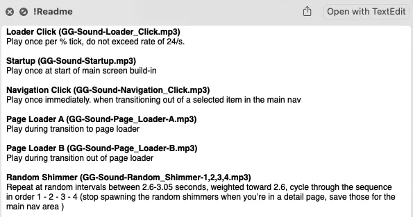
When including the audio, I ran into a huge performance issue that took a bit of time to figure out. The initial findings were that when the sound was checked off, it all ran smooth but when it was on, it was creating a ton of stuttering and slowdown on the load screen in particular. The issue was that HTMLAudioElement.play() was firing about 100 calls from the animation frame during the count. Headless chromium wasn’t able to reproduce it so I ended up using the Safari Web Inspector on-device to see what was going on.
The fix was to stop calling play() per tick entirely and hand the whole sequence to the Web Audio clock in one pass before the count starts. Web Audio runs off the main thread so once it’s scheduled the count costs nothing.
export function scheduleLoaderTicks(durationSec, count = 100) {
  const t0 = audioCtx.currentTime + 0.02;
  const MIN_GAP = 1 / 18;            // rate ceiling, per the sound spec
  const maxTicks = Math.min(count, Math.floor(durationSec / MIN_GAP));
  let prev = -Infinity;

  for (let i = 0; i < maxTicks; i++) {
    // ease the spacing to match the counter's own power1.inOut feel
    const f = i / maxTicks;
    const eased = f < 0.5 ? 2 * f * f : 1 - Math.pow(-2 * f + 2, 2) / 2;
    const when = t0 + eased * durationSec;
    if (when - prev < MIN_GAP) continue;
    prev = when;

    const s = audioCtx.createBufferSource();
    s.buffer = buffers.loaderClick;
    s.connect(gain).connect(audioCtx.destination);
    s.start(when);                   // scheduled, not played
  }
}
In addition, iOS had a few things pop in that <audio> cloneNode() doesn’t carry the buffer, AudioContext auto suspends silently and the physical audio switch on the phone blocks Web Audio entirely. Pairing audio functionality with appropriate visuals meant utilizing an animated EQ glyph to allow the user to select if they wanted to hear the sweet, sweet tunes or not.
Toggle on/off
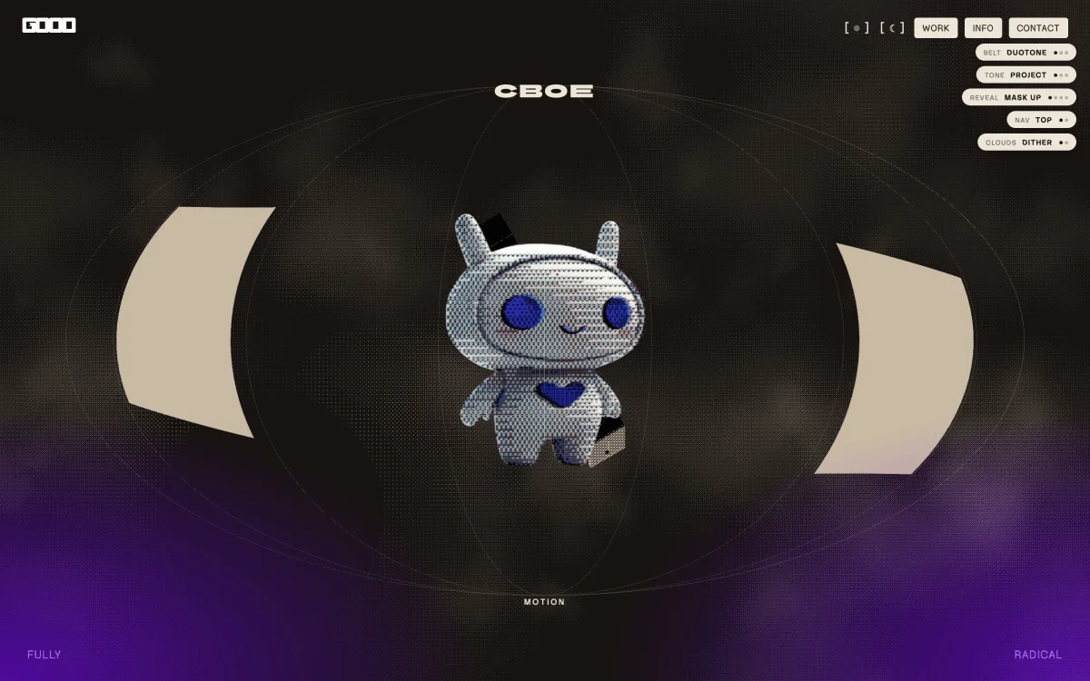
For iterating, one of the methods that was the most helpful was instituting multiple toggle states on the page so that I could A/B test multiple variations and see what felt right in real time. I used this approach for the dithering effect, text animation reveals, colors and several other components on the site. Instead of having to individually code each iteration, this approach saved a ton of time and again, the ability to see it in real time was crucial.
This especially rang true when creating the 3×3 belt matrix and when you went to the “Cognichip” project, the thumbnail was almost not visible when viewed as Duotone. For colors in particular, a theme toggle was implemented via a token set and applyTheme() mutates the shared THREE.color objects in place so the WebGL uniforms update without rebuilding materials.
Phone home
Creating an experience on desktop always gives a lot of freedom in terms of what you can pull off due to the horsepower available. Dealing with mobile, I wanted to be as true to the desktop version as possible so that came with its own set of concessions. Deferring PMREM env generation and the info-page GLB off the preload path and using smaller preview thumbnails for the globe cards helped a lot with performance. For the shaders, discovering that Webkit defers compilation to first draw led to shader warm-up to actually render a frame.
Lessons learned
Going into something that felt more ambitious came with its share of frustration from time to time. With the audio in particular, I spent a long time convinced the stutter was shader compilation. It wasn’t and the thing that actually cracked it was noticing that with the sound off, the preloader ran cleanly and stuttered when it was on. The lesson wasn’t about audio in particular, it was that I was optimizing for something I understood instead of what I could measure. This was a time-consuming factor that I didn’t foresee but also learned a lot from in terms of order of operations. In addition to that, the shaders themselves came with some optimization problems that were eventually fixed via the “warm-up” approach I discussed earlier.
On a positive note, one of the best tips I can offer is to storyboard animations if they aren’t feeling right to you. This can help get more of a granular approach and really see what is actually happening from instance to instance. With a background in motion design, thinking through this in terms of what After Effects could do or even using those terms, such as track mattes, venetian blind transitions, etc. were helpful.
Signing off
I want to give a huge thanks to Manoela and the Codrops team for the opportunity to dive deeper into the making of this site. I hope this can be helpful and also empower you to not shy away from an idea that may seem too difficult. Feel free to reach out if you want to chat further! You can find me via goodgrowth.com or on LinkedIn. Tremendous thanks again to Lane Fujita for the sound design on this!