The recent overhaul of the Obys website is more than just a facelift; it's a deliberate statement about identity and purpose. This move reflects a broader trend among agencies grappling with how to present evolving narratives in a digital world where user experience and brand perception are increasingly intertwined.
The Genesis of a New Identity
The previous iteration of the Obys website, launched in 2019, no longer conveyed the depth and sophistication of the agency's capabilities. As the firm progressed in its work, collaborating with notable clients and producing polished projects, the disconnect became more evident. The visual identity felt stifled, not keeping pace with the evolving narrative of what Obys represented. Thus, the impetus to create something that accurately encapsulated their current ethos became apparent.
Crafting a Cohesive Design Language
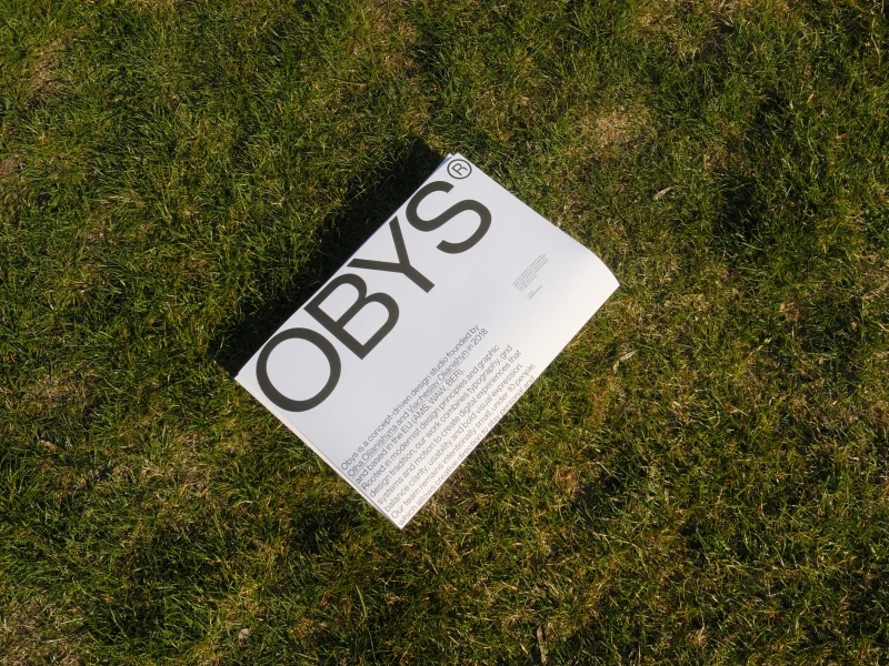
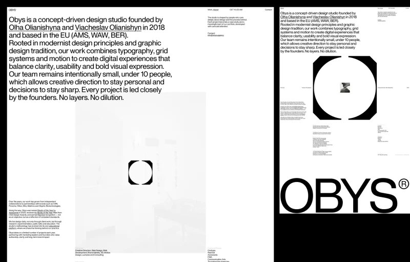
At the heart of the redesign is "OTF Obys NG," a custom neo-grotesque typeface that serves both as a text and display font. This origin point is significant, as the team sought clarity and consistency in their visual communication. The redesigned logo is emblematic of this shift. It symbolizes a spatial concept—an environment that encapsulates their projects and philosophies. The interplay of motion on the website further animates this space, making the logo a recurring anchor point as users engage with different parts of the site.
Visually, the site transitions from the old branding to the new through a dynamic transformation that engages users from the moment they land on the homepage. By starting with the old logo on a dark background, which shifts into the updated design amidst a brighter aesthetic, the experience narrates a journey of evolution—one that reflects both the agency's growth and its commitment to modern design principles.
The Tension Between Innovation and Tradition
The design process was not simply a matter of aesthetics. It involved deep introspection about the agency's vision and values. The team confronted tough questions about their desired level of expressiveness, which resulted in a minimalist approach that nevertheless strives for richness in subtlety. Rather than expanding with superfluous elements, they focused on paring down until they reached a coherent system that reflects their goals.
This ethos extended to working with an external developer for the first time, which enriched their design narrative. Collaboration cultivated new perspectives and sparked innovative solutions, particularly in developing motion and micro-interactions. The challenge was to achieve a seemingly simple user experience, but in reality, it took incessant fine-tuning of every detail—from timing of animations to interactions—to cultivate a blend of effortless elegance and functional clarity.
The Value of Selective Presentation
This new site is intentionally minimalist, focusing on a curated selection of projects instead of overwhelming visitors with excessive information or accolades. The team decided what to exclude rather than include, reflecting a strategic choice to prioritize clarity and purpose. This microsite serves as a transitional phase in Obys's evolution, allowing the agency to showcase its core vision without the clutter of a fully populated archive or history.
Motion as a Fundamental Element
Motion design makes a significant imprint throughout the site. It does not exist merely for decoration; it unrealizes the site's concepts and connects disparate layouts and pages. The initial transformation from old to new showcases this philosophy right from the outset, preparing users for a cohesive experience that feels intentional and curated.
A Technical Backbone for Modern Aesthetics
The website’s foundation is a custom-built codebase that consciously avoids traditional client-side frameworks, employing Bun.js for server-side operations. React’s role is streamlined to server-side templating, which results in a clean output. Motion and user interactions, along with richly developed animations and transitions, are managed in TypeScript, pushing boundaries of what is typically expected in web design. The design team's choice to leverage WebGL for rendering certain graphics underscores their commitment to pushing the envelope in terms of functionality and aesthetic appeal.
A Moment, Not the End
This new digital footprint from Obys is a powerful illustration of a moment in their journey. It encapsulates the shift in their identity while laying the groundwork for future expansions. Known for their exploratory approach, this design doesn't attempt to encapsulate all of Obys's history or achievements; instead, it’s a strategic representation focused on immediate relevance and coherence.
As agencies increasingly seek to define their identities online, the case of Obys provides a thought-provoking blueprint. It invites dialogue around how firms can articulate who they are and where they intend to go—without losing sight of the essence that brought them here. For professionals immersed in digital design and branding, the path taken by Obys reveals that sometimes the most significant innovations come not from adding complexity but from embracing simplicity, clarity, and intent.