Crafting an Engaging Scroll-Driven 3D Experience
If you’re looking to elevate your Webflow designs, the integration of scrolling effects with 3D visuals presents a compelling opportunity. In this guide, we'll create a stunning 3D cube gallery in Webflow, utilizing GSAP for animations and tapping into the power of CMS for dynamic content delivery. Imagine a gallery where each image not only stands out but also transitions in a way that feels fluid and orchestrated. This is precisely what we aim to accomplish: a scroll-driven gallery where images fade seamlessly into one another, accompanied by sliding text animations that enhance user engagement. The centerpiece? A rotating 3D cube that delivers a captivating visual journey along a hexagonal path. What sets this project apart is its reusable structure. After establishing the CMS infrastructure, which we’ll explore, you’ll find that swapping in your chosen visuals and text is straightforward. The underlying animation logic is flexible enough to accommodate varied content without extensive alterations.Embarking on the CMS Configuration
Let’s kick off this project with a clean slate. We’ll start by setting up a CMS Collection dubbed “Pictures.” This collection goes beyond the basics of a traditional image gallery by incorporating several unique fields tailored for our needs. First, you’ll have the standard fields like **Name** and **Slug**. Then, introduce an **Image** field for the visuals—this will be critical as it serves both the background and the cube faces. Next, include a **Text** field for short labels that accompany each image; make sure this stays concise for clarity during animations. Don’t overlook the **Order** field. This integer will dictate image sequencing, which is essential for our cubic display. With a maximum value of 6, it aligns with the six faces of a cube, allowing each CMS item to map precisely to a cube face in our design. But there’s more that lies beneath the surface. Next, you’ll want to add numeric fields for properties like position and rotation which will directly influence how each cube face behaves in 3D space. These fields—**Origin Left**, **Origin Top**, **Move X**, **Move Y**, **Move Z**, **Rotate X**, **Rotate Y**, and **Rotate Z**—are for fine-tuning how we manipulate the cube visually. This approach not only teases out the building blocks needed for the final effect, but it also sets the stage for how we’ll animate and position these elements in Webflow. Each field will articulate details about movement and transformation, preparing us for an intricate interaction design.Structuring the Scroll Interaction
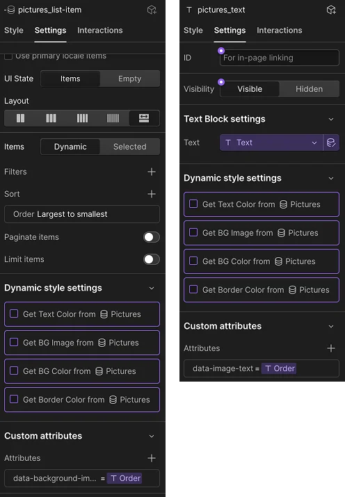
Creating an immersive scroll experience begins with establishing a dedicated section. By setting its height to 500vh, we control the perception of pacing in our scroll animations—more height means a more leisurely scroll effect. Within this section, add a container with the **main-container** class to act as the viewport for your content. It’s crucial that this container fills the entire viewport and remains sticky at the top, so it stays in place while users explore the section. Next, we’ll set up **section_content-wrapper**, which will hold two critical CMS lists: one for our fullscreen background images and the other for the 3D cube itself. We’re not just layering visuals; we’re crafting an entire narrative that unfolds as the user interacts with the experience. By implementing the Collection List linked to our **Pictures** CMS, we ensure that the images are positioned correctly, based on our specified order, facilitating a smooth stacking that aids in the fading transitions we desire. Start connecting dynamically sourced images with well-planned overlays and centered text. This combination adds depth and readability to every visual element, ensuring that our messaging is as polished as the graphics. As we proceed, meticulous attention to these foundational elements will lay the groundwork for the detailed animations and transitions that follow. Each sentence of this tutorial builds toward an engaging user experience, inviting visitors to explore and interact meaningfully. The intention is clear: create a website that feels immersive and sophisticated. In doing so, you’re not just showcasing images; you’re telling a visual story that captivates from the first scroll.Next, let's assign value to the Order field, linking it to relevant elements for better organization.
This approach allows us to adjust each text element separately, enhancing the overall control of the animation.
7. Setting Up the Scroll Interaction
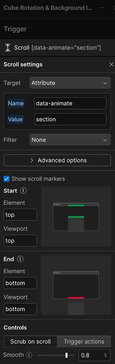
To get started with dynamic scroll interactions, access the Interactions Panel and establish a new scroll action named Cube Rotation & Background Image.
In the trigger settings, shift the focus from Class to Attribute, configuring it with data-animate="section".
Since we want the animation to respond to scroll progress effectively, it’s beneficial to keep the default scroll behavior. A smoothing value of around 0.8 tends to yield desirable results for this kind of movement.
For the animation's thresholds, set it up so the action kicks off as the top of the section aligns with the top of the viewport: Start: Top / Top.
The animation should cease when the bottom of the section syncs with the bottom of the viewport: End: Bottom / Bottom.
With these adjustments, your scroll range is now properly configured.
8. Initiating the First Text-Out Action
Now, let's craft the action that will animate the text of the initial image sliding out.
Begin by adding an Animate Action, naming it: (TEXT) 1 Out.
Adjust the target settings from Class to Attribute, specifying: data-image-text="1".
Set the animation duration to 0.4 seconds, leaving the start value at 0s and keeping the easing linear. This configuration ensures that the animations flow in sync with the user's scrolling.
Concentrate on the animated property, focusing on the Move Y axis alone for this action.
This qualifies as a To animation since the text shifts from its original position to a new one.
Set Move Y to 100%, which will initiate the movement of the text.
At this stage, the text is moving, yet it's unmasked and not staggered properly.
To remedy this, enable Split Text, segmenting and masking it by word, and apply a stagger type of Offset Time.
Then, configure the stagger interval to 0.3 seconds, allowing each word to animate in a staggered sequence.
9. Timing Dynamics in Scroll-Driven Animations
Before diving into the next action, let’s clarify an essential principle of timing in scroll animations.
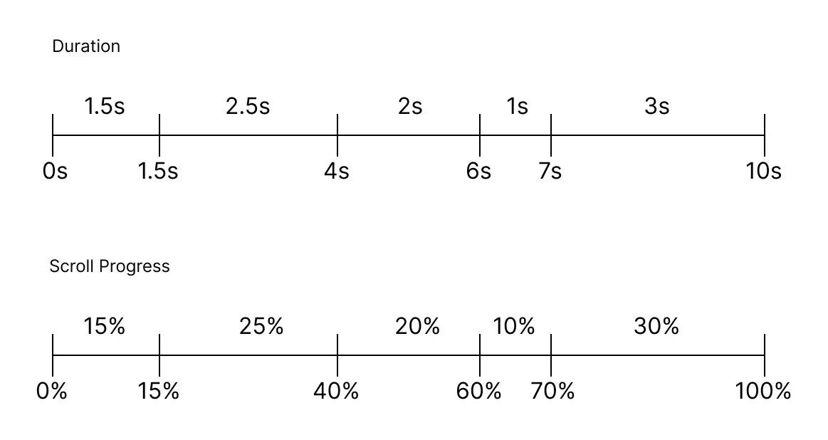
- In traditional timeline animations, duration represents real elapsed time.
- In scroll-driven animations, duration functions differently.
Here, the animation is influenced by scroll position, where the duration indicates a segment of the total scroll area. GSAP will allocate the defined durations over the scroll distance, leading to a unique outcome.
If only one action exists, that single action extends throughout the entire scroll range.
As more actions are added, the scroll interval gets distributed across the complete timeline, emphasizing the importance of understanding duration, start values, and stagger intervals for crafting intricate scroll interactions.
10. Introducing the Next Text-In Action
Let’s move on to create the animation for the second image’s text entering the scene.
Duplicate (TEXT) 1 Out and rename it to (TEXT) 2 In.
Adjust the target so it aligns with: data-image-text="2".
Now, set the start value to 0.6 seconds to provide a slight delay before the second text appears, adding some visual interest.
This time, the animation should have the text slide in from below, requiring a change from the To animation type to From, while keeping Move Y at 100%.
As it stands, the second text will still be hidden from view in the preview.
This isn’t an error; the second text lies within a collection item positioned beneath the first. Since the elements overlap due to absolute positioning, the second text won't be visible until the first fades out.
Let’s complete this transition.
11. Fading the First Image Out
Add a new Animate Action named (IMAGE) 1 → 2.
Use the targeted attribute data-background-image="1" for the first background image.
Set this animation's duration to 0.5 seconds, with a start value of 0.4 seconds.
This structure means the fade out of the image begins while text one is still transitioning, ultimately finishing just before the second text is fully in view.
Focus solely on Opacity in the animated properties.
This is a To animation, aiming to bring the opacity down to 0%.
The first text slides out, the first image fades, and the second text smoothly enters.
12. Replicating the Transition Pattern
The setup we've established is foundational for the first part of our animation.
From here, it's a matter of duplicating the same three actions for subsequent transitions while only modifying two parameters:
- The attribute values.
- The start values.
For the transition from image two to image three, duplicate (TEXT) 1 Out and rename it to (TEXT) 2 Out.
Update the attribute value to 2 and set its start value to 1.5 seconds.
This creates a slight pause between the end of the first transition and the beginning of the second.
Next, duplicate (TEXT) 2 In and rename it to (TEXT) 3 In.
Change the attribute value to 3 while adjusting the start value to 2.1 seconds for proper timing.
Finally, duplicate (IMAGE) 1 → 2, naming it (IMAGE) 2 → 3, and set its attribute to 2 with a start value of 1.9 seconds.
That timing emerges from summing up the previous offsets: 0.4s + 1.5s.
This pattern can be continued for subsequent transitions as needed.
13. Analyzing the Animation Timeline
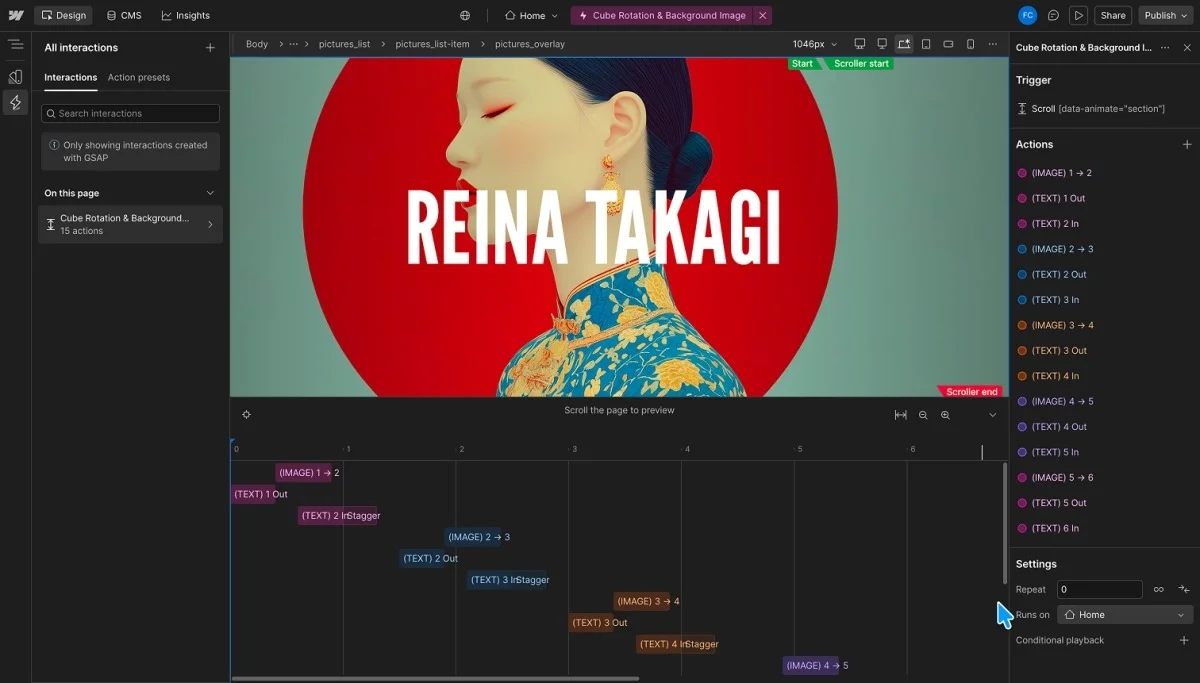
After establishing all transitions, it’s beneficial to visualize the overall timing outside of Webflow’s default timeline view.
For instance, the conclusion of the first transition at 1.3s coincides with the initiation of the second at 1.5s.
This interval yields a 0.2s gap, which introduces a subtle anchoring effect at the end of each transition. Personally, I find this method adds a certain rhythm and intention to the animation.
If you prefer a more fluid motion without pauses, you can eliminate the gap by decreasing the start values for the second group by 0.2s.
For sequential groups, apply reductions similarly, e.g., 0.4 seconds for the next.
The core takeaway is less about the specific values and more about grasping the connections between the actions in your timeline.
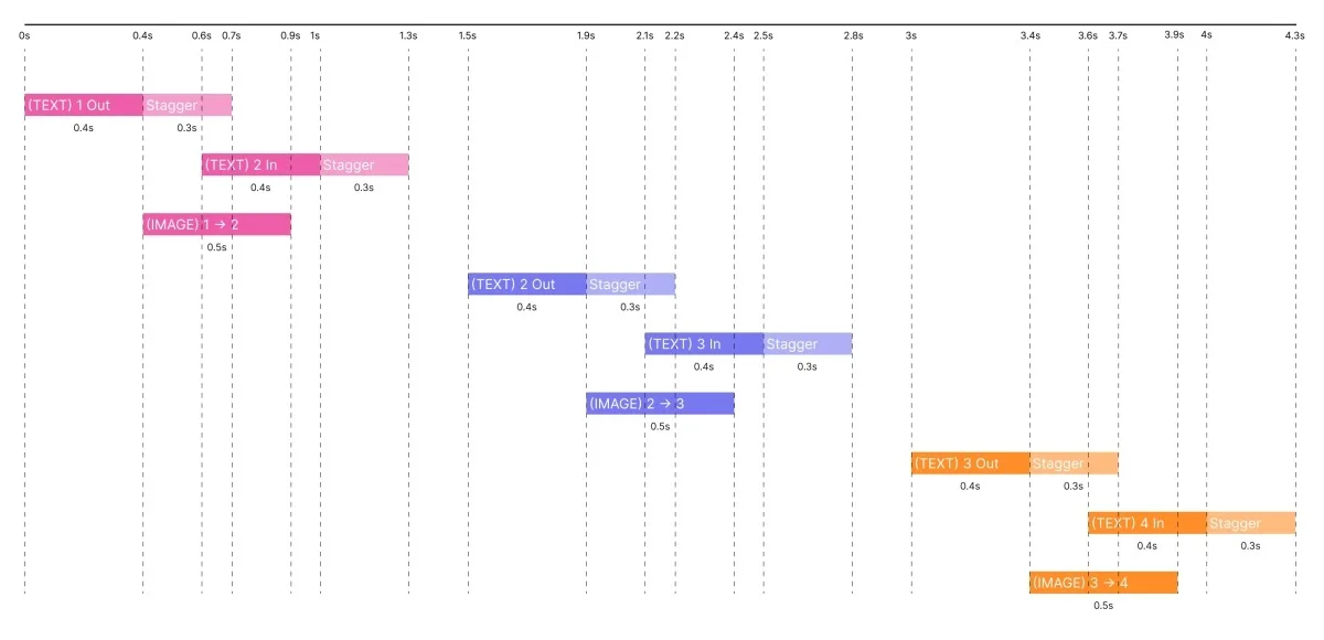
With the transitions for the background image and text configured, we can now pivot to the second part of this project: crafting the 3D cube.
14. Setting Up the Cube Collection List
Within the section_content-wrapper, add a secondary Collection List that connects to the same Pictures CMS Collection.
This new Collection List Wrapper should be assigned the class pictures_cube-list-wrapper.
Set its position to Absolute while selecting the Full option for dimensions.
Change its display setting to Flex and center the content both vertically and horizontally.
Positioning the cube centrally in the viewport simplifies its management and manipulation.
As the cube needs to overlay the background content visually while allowing interaction with the text below, set pointer events on this wrapper to:
pointer-events: none;Next, we need to apply a crucial 3D setting: perspective.
Go into the 2D & 3D Transforms settings and input a perspective distance of approximately 1000px.
This value can be fine-tuned depending on how pronounced you want the perspective effect to be.
Since the cube remains centrally located within the same wrapper providing the perspective, it won't appear distorted even when a face is parallel to the screen.
To facilitate future animations, add the attribute data-animate="cube-list-wrapper" to this wrapper.
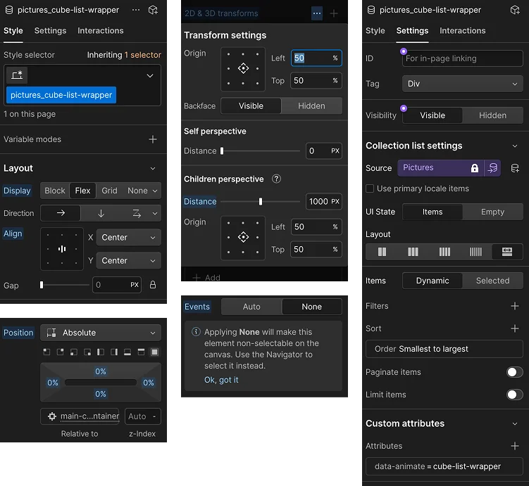
15. Laying the Blueprint for the Cube
Select the Collection List itself and assign it the class pictures_cube-list.
This element serves as the foundation for the cube's faces.
Start by making it square by adjusting its aspect ratio to Square.
Next, set its position to Relative, allowing the items within to adopt absolute positioning.
We need to establish two custom CSS properties. The first is:
transform-style: preserve-3d;This command ensures that browsers don't flatten transformed children into their parent's plane. Since we're constructing a true 3D structure with multiple surfaces in depth, preserve-3d maintains the 3D spacing of child faces.
The second property to use is:
container-type: size;While the theory around this property is deep, its practical application here is straightforward: it allows us to utilize percentage-based values for movement along the Z axis.
Without this setup, percentage values get tied to dimensions like width and height, not depth. Now we can say, “move this cube face by 50% of the cube side on the Z axis.”
Finally, assign a width to the cube list of:
width: min(30vw, 30vh);Why combine min() with vw and vh?
This ensures the cube retains its responsiveness across various viewport sizes and aspect ratios.
In wider screens, the height typically limits the size, while in narrow vertical screens, width becomes the constraining factor. Hence, the cube adjusts according to 30vh or 30vw.
While the value 30 is adjustable, it strikes a nice balance for this particular project.
Lastly, add the attribute data-animate="cube-list" to this element for later animations.
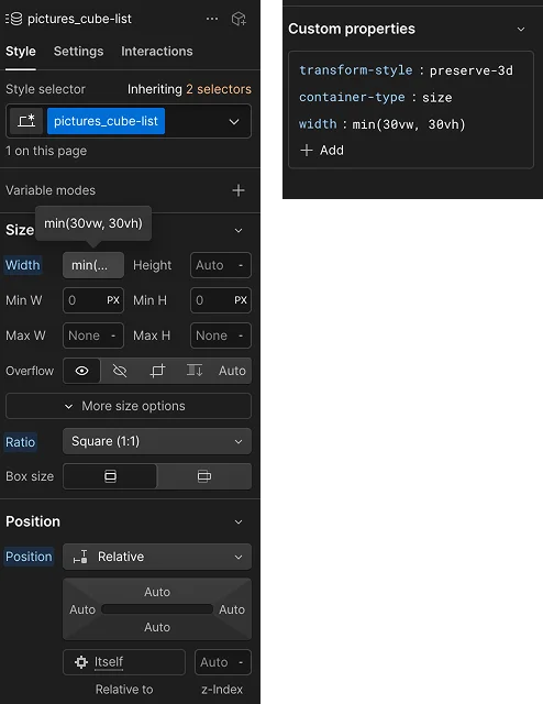
16. Constructing the Cube Faces
Select the Collection Item within the cube list and assign it the class pictures_cube-item.
Configure it to be Absolute and select the Full option for dimensions. Then, reset pointer events back to:
pointer-events: auto;Why is this relevant?
The parent wrapper has pointer events set to none, but the individual cube faces should remain clickable. For instance, each face could link to a project page, blog post, or case study.
Within each collection item, introduce a div block, applying the class pictures_cube-image-wrapper.
Set the width and height of this wrapper to 100%. Subsequently, include an image that connects to the CMS Image field and assign it the class pictures_cube-image.
For the image settings, apply the following:
width: 100%;
height: 100%;
object-fit: cover;
Optionally, introduce a small padding to the image wrapper, such as:
padding: 3%;This diminishes gaps between adjacent cube faces. At this juncture, all images will still appear stacked on one another.
This setup is entirely normal, as we haven’t yet defined how they will form a functional cube.